|
home page | background | contact | copyright | theology of icons | history of icons | icons a | icons b | icons c | icons d
|
|||
|
Background
|
|||
|
|
In 1992 I was baptised Christian Orthodox at the Monastery of Saint Mary Magdalena in Jerusalem. There I began to learn to paint icons and stayed in Israel for eleven months. In 1993 I moved to Paris and studied icon painting with Natalie Maidonovitch who had been a pupil of Leonid Ouspensky. In 1994 I began to study in London and later to work, with Mariamna Fourtounatto ,who also had been a pupil of Ouspensky. I paint icons in the traditional style, most influenced by early Russian icons of before the sixteenth century. These icons are simple in style, without naturalistic influence or embellishment but deeply spiritual.
I also find the modern day icons of Ouspensky (1902-1987) and Father Gregoire Kroug (1908-1967) very inspiring. They were both Russian exiles, who lived and worked in Paris. Their work is full of light and depth and represents the mood of the twentieth century icon. In each century icon painters have found new ways of expressing the spirit of holiness and light which is their unconscious revelation, a vision of the heavenly that expresses that time. |
||
|
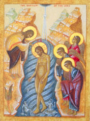
The Baptism of Christ |
|||
|
To make an icon I take a block of wood and apply a layer of gauze, then fifteen layers of gesso (whiting mixed with gelatine). This is sanded until smooth and the image is drawn using an earth pigment. The painting is done, beginning with the darkest colour and finishing with tiny strokes of highlight that illumine the icon with a brilliant transfigured quality, so that the figure depicted glows and becomes luminous. The early icon painters used only natural pigments that blended and harmonised well together. Most colours would be found locally and thus reflected the landscape where the icon was painted, expressing a spiritual affinity with the area. Some early icons only contained a few colours which would then be repeated many times almost like a pattern, bringing great simplicity, peace and harmony to the image. I like to use earth colours also. The most beautiful yellows, blues, greens and reds can be found hidden in rocks, stones and sand, then ground into pigments. To paint, I use a technique called ‘egg tempura’ (a mixture of pigment, egg yolk and water) that has been in use since the eighth century. |
 |
||
|
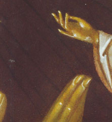
Detail: The Mother of God of Iverskaya |
|||
 |
I apply the paint using an ancient Russian technique called 'petit lac' or ‘little lake’. To do this the board is laid horizontally and layers of very thin wash are flooded onto it, until the right density of colour is reached. The technique leaves a very transparent effect so that the white of the board shines through. Paint which is used for the light and highlights becomes progressively thicker as the icon progresses. The last thing to be painted on is the name belonging to the image. Without the name the icon is incomplete and cannot be blessed. The Fathers of the seventh Oecumenical Council stated that the name on an icon guarantees the true likeness of the saint depicted. It is like an official seal. Some months after the icon is finished, I apply a very thin layer of linseed oil varnish (called olifa in the Russian language). This brings out a glow and transparency in the colour that was not there before. However if the olifa is any thicker the icon soon darkens and becomes yellowy in colour. This is what obscured the beauty of many ancient icons. Finally, the finished icon is taken to the church to be blessed. This can be done by asking the priest to hold a special service, or else by asking him to place it on the altar during The Divine Liturgy.
|
||
|
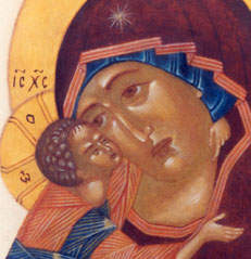
Detail: The Mother of God of Tenderness
|
|||
|
home page | background | contact | copyright | theology of icons | history of icons | icons a | icons b | icons c | icons d |
|||